DUNBRAE: Recreating a Brand Identity

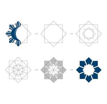
The Dunbrae logo began as a design deeply rooted in tradition, drawing inspiration from the Philippine flag’s iconic 8-rayed sun. This classic emblem not only represented heritage but also reflected the values and vision of the company’s leadership. When the time came to refresh the brand, the challenge was to modernize without erasing the essence of the original design. The goal was to respect the CEO’s vision, preserving the symbolic sun while allowing the logo to evolve into a more contemporary form. The rebrand was a journey of balance as it honored the past while looking boldly toward the future.
Rebranding the Dunbrae Logo
At the heart of the redesign was the idea of evolution rather than reinvention. The new logo retained the core symbolism of the Philippine sun, but with a modernized look that resonates with today’s design standards. Its clean lines, refined geometry, and simplified structure give it a professional yet timeless appeal. This approach ensures that while the logo feels fresh and forward-looking, it still connects to its origins and maintains continuity with the brand’s heritage. The updated design captures the spirit of innovation while preserving the story embedded in the company’s identity.
Creation Concept
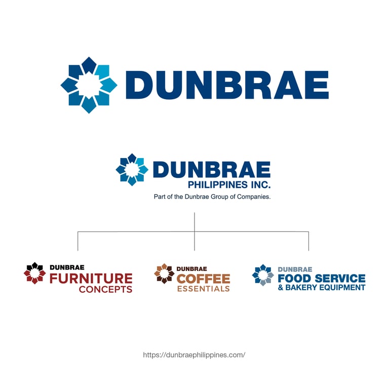
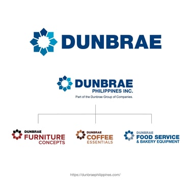
One of the most important aspects of the rebrand was adaptability. Dunbrae’s growth into diverse ventures—including coffee machines, brewery services, furniture manufacturing, and bakery equipment supplies—required a logo versatile enough to unify all these businesses under a single identity. The new logo provides that flexibility, serving as a strong visual anchor across industries while remaining cohesive and recognizable. It symbolizes resilience, progress, and unity, and proves that a well-crafted design can transcend time and sector. More than a logo, it stands as a testament to Dunbrae’s ability to evolve, adapt, and inspire across every chapter of its journey.
Brand Applications
GLOBAL FACILITIES MAINTENANCE: Defining the Brand Look

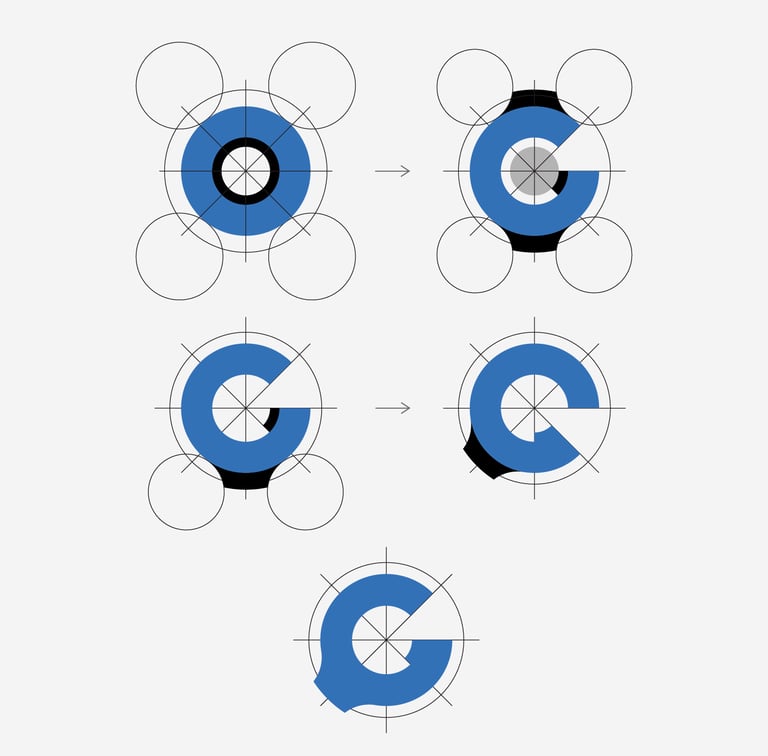
Global Facilities Maintenance carries a name that demands recognition, strength, and trust. The challenge was to design a logo that lives up to the prestige of the word “GLOBAL” while avoiding overused industry clichés. Too often, globe icons, wrenches, or tool imagery dominate maintenance branding, but this approach would not do justice to the company’s vision. Instead, the new identity needed to be distinctive, sophisticated, and professional—crafted to resonate with medium to large enterprises and to reflect the level of quality that defines Global Facilities Maintenance.
Elevating the Global Identity
The creation process was guided by the principle of differentiation. Rather than leaning on predictable symbols, the focus shifted toward designing a mark that embodies refinement and memorability. Every element of the logo was carefully considered to communicate excellence in maintenance services without relying on obvious visual shortcuts. Clean lines, modern styling, and a polished aesthetic came together to form a logo that is easily recognizable, while also carrying the elegance needed to engage high-end clients. This design not only stands apart but also speaks directly to the professionalism and reliability that Global Facilities Maintenance delivers.
Designing with Purpose
One of the most important aspects of the rebrand was adaptability. Dunbrae’s growth into diverse ventures—including coffee machines, brewery services, furniture manufacturing, and bakery equipment supplies—required a logo versatile enough to unify all these businesses under a single identity. The new logo provides that flexibility, serving as a strong visual anchor across industries while remaining cohesive and recognizable. It symbolizes resilience, progress, and unity, and proves that a well-crafted design can transcend time and sector. More than a logo, it stands as a testament to Dunbrae’s ability to evolve, adapt, and inspire across every chapter of its journey.
Brand Applications
SAME PAGE RENDER: Reshaping the Icon
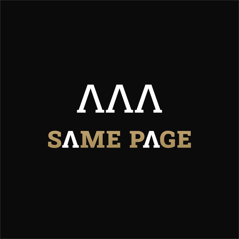
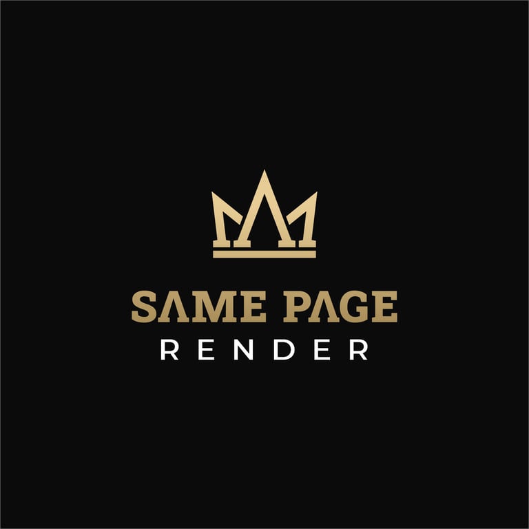
The Same Page brand had long carried a crown icon as part of its identity, but over time, this element lost its uniqueness due to its resemblance to common stock images. The challenge was clear: the logo needed to evolve into something that would stand apart in the industry while staying true to the company’s distinct name and reputation. The redesign aimed to preserve the crown as a recognizable element, yet reinterpret it in a way that emphasized originality and individuality, ensuring the brand could shine in an increasingly competitive marketplace.
Redefining the Crown
The mission was not only to modernize the crown icon but also to ensure it worked in harmony with the chosen typeface, creating a logo where every element felt relevant and consistent. The serif slab font was carefully selected for its bold, solid appearance, symbolizing strength, reliability, and premium quality—values that perfectly align with the company’s expertise in cement rendering and plastering. Its sturdy structure reflects the durability of the trade, while its refined styling elevates the overall identity to appear professional and enduring. By pairing the redesigned crown with this robust font, the logo achieves both unity and distinction, reinforcing the brand’s core identity and making a powerful statement of originality and trust.
Strength in Design
The crown icon itself was reimagined to capture meaning from within the brand name. Drawing inspiration from the letter “A” in “Same Page,” the new crown design creates a unique and memorable visual symbol directly tied to the brand’s identity. This innovative approach eliminates any reliance on generic imagery and replaces it with a bold emblem that is distinctly recognizable and deeply connected to the company’s story. The result is more than just a redesigned logo—it is a confident statement of originality, professionalism, and strength that will carry the brand forward with clarity and pride.
A Mark of Originality
Partnering with ARTJIM has been a great experience for our team. He supported us by creating branding guidelines, logos, brochures, and other printed materials for our clients. His designs consistently captured the essence of each brand while delivering a polished, professional look. Beyond creativity, Jim brought reliability and attention to detail, making the entire process smooth and efficient. Our clients were impressed with the results, and we highly value his contribution.
Jay Godfrey
impaktmedia
★★★★★
Contact
Need a Design Partner?
© 2025. All rights reserved.
